culinary care

CLIENT
Culinary Care

DURATION
Three weeks

DELIVERABLES
Competitive analysis
High-fidelity mockups
Prototype
Style guide
Style tiles
Usability testing

intro.png
 

BRIEF
Creating & designing a responsive portal for chemotherapy patients to order high-end restaurant meals through Culinary Care. The portal provides users an easier access to their meals within the palm of their hand as an alternative from calling in. 

 
background.png
 

What is Culinary Care?

Culinary Care is a non-profit organization that provides high-end restaurant meals to individuals undergoing chemotherapy. The founder of Culinary Care felt that patients providing food for themselves and their families should be the least of their worries compared to everything else they face. My team was asked to redesign the homepage for Culinary Care and design a portal for patients.


login.png
homepage.png
upcoming.png


The original portal was wireframed by a team of UX designers at DESIGNATION. The homepage leaned towards donors and got confusing for patients who wanted to enroll for meals. With the portal, patients would have a responsive app meant for them.


Screen Shot 2017-07-25 at 12.41.34 PM.png
 
Screen Shot 2017-07-25 at 12.41.05 PM.png
 
 
“I struggle to find food she can face eating during her treatment. Her tastes change from one day to the next.”
 
“It’s hard to plan anything because I don’t know if I will be allowed to receive treatment today.”


Among them were two personas that best represented the users. Will, a caregiver for his wife. His goals consisted of finding food that his wife can eat, finding a way to provide his wife with a distraction, and giving her something to look forward to. His motivations were getting his wife fed and making her feel special. He needed the ability to change food items more easily due to sudden effects of her treatment. He also needed a way to get food without leaving his wife alone during her treatments.

Diane, a patient, needs to get food as easy as possible and being able to feed herself and her caregiver on treatment days. Her motivations were to treat herself and find a way to feel special. Diane needed transparency in terms of how the process of enrolling works, eligibility, what food is on order, how many people it feeds, and delivery. She also needed a clear “request a meal” form with an easy process.


With a clear idea of who our personas were, we also met with Courtney, the founder of Culinary Care. We presented to her a GUT test, which is compressed with several design styles.

 
Group.png
Screen Shot 2017-07-31 at 8.41.12 PM.png
Screen Shot 2017-07-31 at 8.41.28 PM.png

“It’s clean and hospitality-driven”

“Looks light, welcoming, and inviting”

“It doesn’t look clean and elegant. It's screaming TGIFridays”


competitive analysis research

The information we gathered after meeting Courtney was that Culinary Care is best represented with realistic, clean, and elegant designs. The hero image was favored with a bright CTA button and a large amount of white space would give a hospitality-like look.

After getting a better idea on what Culinary Care represented, we looked at some in-category and out-category competitors.


Group 3.png
Group 4.png
Group 5.png

Charity Water

  • Uses high-resolution hero images with a large and bold headline to bring a connection to the viewer
  • Uses large CTA buttons and minimal use of colors to guide users’ eyes

UberEats

  • Has a successful minimal design with enough white space to not look overwhelming
  • Uses one primary color for their brand while having photography be the main attraction

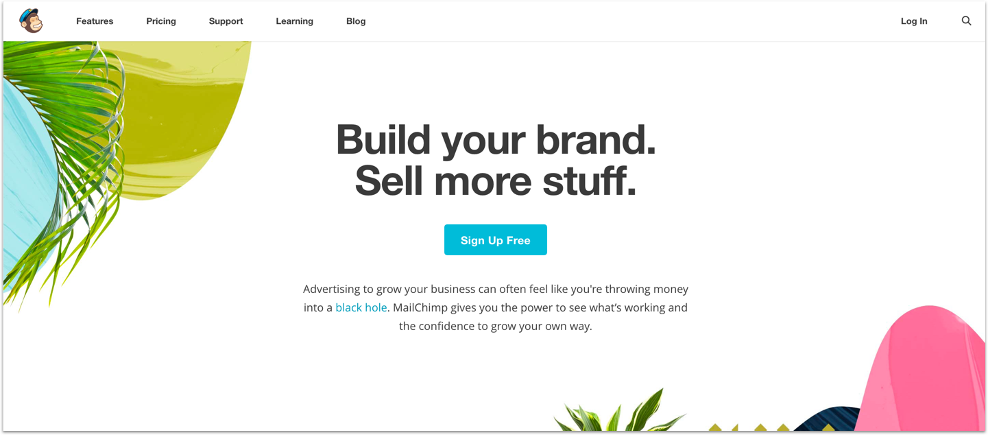
MailChimp 

  • Has a great use of whitespace
  • Implements their hierarchy well
  • Leads users’ eyes with the use of the bright primary color
  • Provides a well developed responsive site


my approach

With our principles lined up, the UI team and I started creating our own style tiles to present to Courtney, to showcase possible directions for Culinary Care. She mentioned during our first meeting that she wanted a restaurant feel to her brand, but I provided styles to show her that although Culinary Care provides food, it doesn’t have to follow a restaurant trend.


ST1.png

This style tile was peaceful and inviting. I created this style tile based on, “Your meal’s on us”. Because Culinary Care wanted to brighten up users’ day with a treat and invite them to be part of the community, I used a warm and flat orange tone, Arsenal, and rounded icons to look more friendly.


This was designed to look more friendly and warm. Based on all three design principles, I used an elegant image of food that looked high-end. I also incorporated the typeface Cicle, which brought a friendly look with its rounded letters. I decided to use colors active on their site to give familiarity and used blue as the CTA color. I felt that the green, blue, and brown worked well together and gave the feeling of warmth without using warm colors.


For this one, I wanted energy and fun. I used a bright salmon for the CTA buttons for high energy and clear hierarchy. I also incorporated rounded buttons, icons, and Hind, to provide the fun and young aspect of Culinary Care.

The clients really appreciated the use of existing colors and how inviting it looked, so I moved forward developing the second style tile. With that, I created my key screens for user testing: the homepage, patient homepage, the enrollment form, and the portal.


where_mobile wire.png
where_mobile v1.png


One of the functions I changed was how users chose their location for receiving meals. Because each hospital has different building names, squeezing that information in a button looked overwhelming. Because this was meant for a mobile responsive site, I made two dropdown menus. One menu consisted of the location names and the other the building names. With this design, the user could choose the right location without being overwhelmed by the amounts of scrolling and text.


user testing and iterations


version one

patient page

homepage

Desktop v1.png
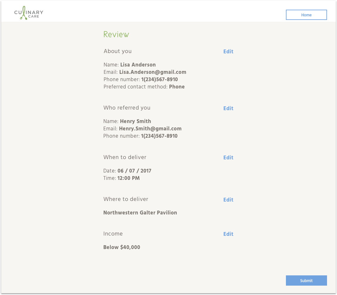
enrollment v1.png

enrollment form

form v1.png
 

We tested key screens in the first user test, and the primary feedback from testers suggested my screens were unrelatable—the photography didn't showcase realistic Culinary Care food. They wanted to see the food they’d receive. Another point users mentioned was a dislike for dark images. Even though the photos were crisp, the food looked less appetizing when it was presented on a dark surface. Overall, the users felt neutral about the look.

For my iterations, I created three A/B tests for photography. The reason for this test was to see if users wanted photos on a more intimate level.

  • Images of takeout and food displayed with nice silverware

  • Food using light and dark backgrounds

  • Using images that Courtney provided of real patients receiving their food

Finally, I also changed the title typeface to Arima Madurai but kept the body typeface, Hind. Often, the hierarchy was lost because Cicle wasn’t bold enough and I needed more weights to use in a primary typeface. With Arima Madurai, even though the title color used was often a shade of green, the boldness of the typeface kept the hierarchy order.


version two: a/b tests

abgourmet.png
 

In this test, users leaned more towards the food that was well presented. When asked why, they said that they understood the idea behind food in takeout, but it’s still nice to see food presented well. It looked more appetizing.


abdark.png
ablight.png
 

All users loved the photographs that used a lot of white space and had lighter backgrounds.


This was the most interesting result. When I presented images of real patients receiving food, no user liked the image and one mentioned that it brought back memories they didn’t want.

For the final iteration, I chose to keep the light photography. I also used images of food that was presented well, and decided to stick with images of food instead of people.


final screens


desktop screens

homepagefinal.png
enrollfinal1.png
 

View the desktop prototype


mobile: enrollment

 
finalmobile1.png
 
finalmobile2.png
finalmobile3.png
finalmobile4.png
finalmobile5.png


mobile: portal

 
finalportal1.png
17 portal 1.png
 
16 portal.png


View the enrollment (left) and portal (right) prototypes

I created a desktop and mobile style guide to provide UI guidelines for other designers and developers.
Click to view the style guide.


future considerations


If there was more time for this project, there are a few things I would have explored and researched.

  • More interviews. Although we interviewed several patients who are currently receiving meals, we weren’t able to interview caregivers, donors, volunteers, and men. With more time, it would’ve been nice to have a large variety of users to have a better understanding on what users wanted.

  • Professional photography. Because many patients lose their appetite during chemo, the images of food needs to be visually appetizing. During testing, users mentioned wanting photos of the food they’d receive, but also appreciated the elegant look of the photos used in our designs. If Culinary Care could hire a professional to take photos of the food users receive, it might bring more customers to the brand.

  • Providing users their own site. The current homepage for Culinary Care is donor-facing and caused confusion to the users who wanted to enroll for meals. With our iterations, we provided them with their own section of the site, but they still needed to head into the homepage to get to where they needed to go. If users got their own site, it could cause less confusion on how and where to enroll.


what i learned


Redesigning for Culinary Care was my most challenging project to date. I wanted to create something great for a great organization. Because I’ve worked in a hospital setting, I’ve learned about the hardships patients and their families go through. Knowing this organization takes out the worry of whether a patient and their family will be fed for one meal made me happy. It helped me to keep the flame burning and to always think of the user first.

This project was also my first time conducting an A/B test during user interviews. I learned that there were multiple ways on getting information from users during interviews and to be precise with my questions. I learned to improvise as well. Besides writing an outline of questions to ask, I learned to read people and communicate with them the way they felt most comfortable.